
Starflight has long been one of my favorite games, although its interface is very annoying…sometimes I wonder how I put up with stuff like that when I was younger (answer: I didn’t have another space opera RPG to compare it to, of course).
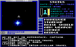
I’ve been playing Starflight 1 and 2 again as reference for Star Revolution. I was playing Starflight 2 when I noticed something odd…look at this screenshot. Doesn’t it look weird in some way?

And doesn’t this screenshot of Starflight 1 look kind of…chunky? Even for a 320×200 game?
In fact…
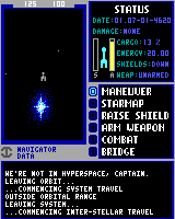
This is a screenshot for the original Starflight reduced to 160×200. Notice that all of the text is still readable and all the graphics look the same, just narrower. It’s almost as if the game were written to run in 160×200…which is exactly what it was. Starflight was written to run in a 160x200x16 color mode available on some CGA/composite monitor combinations (most notably Tandy and Compaq computers). When the EGA and VGA versions were created, the image was simply doubled horizontally.
Which brings us back to the Starflight 2 screenshot.
Notice how much more detailed the picture of the Tandelou Eshvey looks than the rest of the interface! The developers of Starflight 2 did not bother to try to make the interface look any better, even though Starflight 2 was written specifically for VGA! The only thing they did was use the additional horizontal resolution to make the font a bit clearer. How disappointing!
Regarding Starflight 2, I think in all fairness to the developers you need to remember the game was required to fit onto single floppy disks. The re-use of the simple Starflight 1 interface for the ship might not have been a case of lazy developers but rather a space/data savings decision that allowed them to expand the universe and provide greater detail for interaction points with aliens. Be that communication images, trading posts or the wider variety of alien civilizations that were made available in part 2.
Cheers,
P.
As for the 160×200 resolution, I’d say it was because of the
Commodore 64 having half the horizontal resolution (of a base
being 320×200) when using multicolor (16 colors) mode.
Commodore 64 already had a couple million users by that time,
much much more than any CGA PC.
Mef: An excellent theory! Unfortunately, the original version of Starflight was written specifically for the IBM PC. There was a Commodore 64 version, but it was a port done much later.